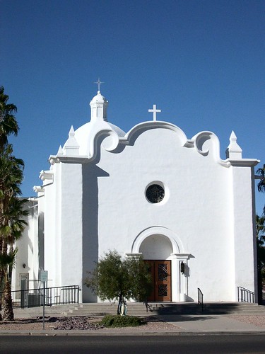
Front Elevation: Immaculate Conception, Ajo, Arizona. A complex and beautiful detail--and one which would be fairly inexpensive to reproduce--enlivens and elevates an otherwise simple facade.
My favorite Smith work, and one of only two churches I am aware that he undertook, is the parish church he designed for Ajo, Arizona (the name means "garlic") as part of a masterplan for the would-be southwestern-style garden city. Immaculate Conception is intriguing, first, as it was designed as part of a new urban context, and not merely plopped into a suburban lot with only convenience as the determining factor. It faces onto the town's curvilinear main plaza, flanked on the opposite side of the road by a Protestant church originally intended to be of similar, if smaller and simpler, design.
This move--of differing denominations given equal time on a main square--is not an uncommon move in more recent attempts to plan an ideal city in a religiously mixed society; Lutyens did something similar with his plan for Hampstead Garden Suburb where the established Anglican church sends its spire upward next to the domed top of a Free Church meeting house. More recently, the folks at Seaside plopped a nondemoninational chapel down in their town more as a bit of urban furniture than an actual place of worship, and even then, as a civic gesture, the strange bit of preserved dune scrub later placed between the chapel and Seaside's Ruskin Square effectively negates any meaningful relationship between it and the town as a whole.
The church at Ajo has the happy advantage of being built in the southwest--like most of Smith's works--and thus is built in an adaptation of the local Hispano-Mexican vernacular. Stucco and adobe are capable of covering a multitude of budgetary sins, and also have the advantage of adding interest through their mottled surfaces to the vast unadorned walls that are often forced on the unmoneyed client. At the very least, with Catholicism raplidly expanding in the south and west, a careful study of such stucco and adobe work seems a very good idea for a church architect to undertake.

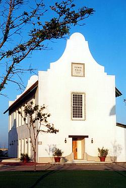
Merill & Pastor's recently completed elegant Carribbean Colonial-inspired Rosemary Beach Town Hall in Florida.
Recent secular work, such as that undertaken at Seaside and Rosemary Beach by firms such as Merrill Pastor show that not all modern stucco-work is of the supermarket strip-mall variety; such a wall-driven aesthetic allows money to be spent on refining and detailing to the highest level only very crucial symbolic and practical points in a church project. Smith is not the only architect within the last century to do decent simple work with the style--indeed, mixtures of low mission baroque and Romanesque revival crop up in an astonishing number of places and with a surprising quiet dignity. There's even a handsome mid-century brick-and-stone Romanesque church in chilly and distinctly un-Hispanic South Bend, Indiana, with a few generic Baroque flourishes that elevate it from commonplace to clever, especially considering the budget it was doubtlessly built on.
Indeed, Smith's other ecclesiastical project, a funeral memorial chapel-cum-vault, is in that mixed Romanesque-Baroque mode, with a simplified Baroque dome and a stripped-down Lombardic-inspired gable. It is a flexible style, and worthy of emulation for those having to count their pennies. Still, I'd caution architects to be careful with their revivalism--I can think of a good many bad Taco Bell-esque edifices inflicted on the Southwest, as well as even fairly good Spanish Colonial-style structures in places where they manifestly don't belong--wet South Florida, where a whole pueblo would wash away in one hour of summer rain, or even Minnesota, where vigas and bell-walls simply don't belong.

Holy Cross Parish, South Bend: Not a George Washington Smith project, but a somewhat later example of mixed Romanesque and Baroque elements, here adapted to a Midwestern contect.
Smith's church is more baroque than it is Romanesque, and it points to the curious fact that while America has always felt mildly uncomfortable around this most Italian and Catholic of styles, somehow in the southwest, its Spanish cousin seems to avoid setting off alarm bells for one of our nation's numerous stylistic neuroses. Perhaps the Franciscan connection is appropriately soothing. Whatever the reason, Smith's design is a brilliant example of how simplified Baroque detailing can enliven a remarkably plain, even stark, facade. Gothic suffers when reduced to basics, and full-blown pure Romanesque really requires real stone (and sometimes brick) to truly sing.

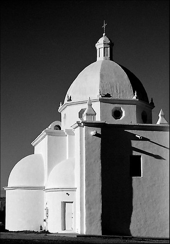
Immaculate Conception: the apse. Note the complex results achieved through the judicious combination of simple elements and the visual interest resulting from the distinct texture of the stucco. .
Immaculate Conception is a brilliant budget response to both the historical context of its site, and designed in such a way that its environment almost automatically brings out the best in it. Using a dome, rather than a campanile, to be the visual focus of the composition, is particularly clever, as it serves to dignify both the interior of the church and its exterior. A campanile has presence only on the exterior, and its purpose can be easily duplicated through a simple bellcote. The rough stucco enlivens potentially dull blank surfaces in a time-tested way seen across the whole of the Southwest--Georgia O'Keefe's painting of the oddly massive and unintentionally sculptural rear buttress of the Rancho de Taos parish church comes to mind--while its blinding whitness is all the more beautiful under an Arizona blue sky that lends itself to simple silhouettes. Still, while simplified, it is not merely simple, and its component parts not basic building blocks but cleverly massaged to pack the most into very little. While fairly cost-effective for its time, the design does not shy away from complex elements such as a dome or a conceptually elaborate--if simply rendered--broken pediment. A project such as this shows that baroque detail need neither impare the cost of a church, nor is it a style alien to the roots of American Catholic culture.

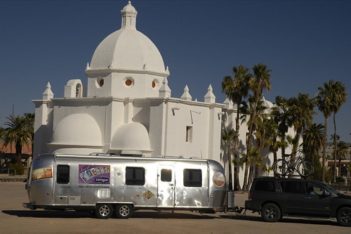
Immaculate Conception: Another view of the rear; note the bellcote to the left of the dome. On the whole, striking: though the dome's lantern might have been more interesting with true windows, rather than being blind as designed.
Simplicity does not mean plainness, or austerity. Nor does it is achieved by shying away from "fancy" details such as domes, cupolas, vaults or the elegant touch provided by a judicious bit of baroque detail. Such are the lessons taught by the church at Ajo, and they speak to the future of parish projects across both the Southwest, and in more abstract ways, the whole country.
1 comment:
I've noticed a similar stucco simplicity in some churches in Greece.
Post a Comment