Monday, December 25, 2006
Yearend Roundup 2
Following from below, (at least) 5 big positives occurred in 2006, which by no means should suggest that things couldn't be better in 2007. Here are 5 fun tasks for 2007.
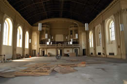
1) A section of the ceiling has fallen in at Marytown in Libertyville. Some of the great plasterwork in the Archdiocese is now in bits and pieces (but nicely arranged!) on the ground. Managable, worthy project, for those so inclined.
2) St. John of God and Sherman Park remain the most regrettable neighborhood in Chicago. A landscape masterpiece by Frederich Law Olmsted, and one of the great Schlacks churches of Chicago, lay wasting in this miserable neighborhood. I have a plan, if there are any takers...
3) The developments at Barat remain as hapless as one year ago, saving the decent Old Main building in a tortured tradeoff to destroy the Chapel, as masterpiece of Ecclesiology. Nearly 200 years after beating back the secularists in Revolutionary France, the Sisters of the Sacred Heart are having a whale of a time beating back the secularists of Lake Forest, Illinois. Here's a Christmas Whack to the vile developers, and an assurance of more to come next year. Fight the good fight!
4) Speaking of the Sacred Heart, Sacred Heart Academy is building a new Chapel in traditional Catholic Style. Checks anyone? It is a good one.
5) Ss. Cyril and Methodius in Chicago/Englewood has a very pleasant look about, and would make a perfect neighborhood anchor. Given the magnificent herd of Franciscan Friars I saw walking by it last week, one might want to get Herman Gaul's view of the Heavenly City.
Merry Christmas!
JBP
Friday, December 22, 2006
Yearend Roundup-2006
Everyone needs one of these, so if you missed it, here is some of went on in the Chicago area in traditional eclesiology.
1) James McCrery has been chosen to design the $8 Million Shrine to the Divine Mercy at St. Stansislaus Kostka, the mother Church of Polish Catholics in America. Round of applause to Mike Sullivan for answering prayers (and the telephone) leading this effort.
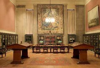
2) Church closings were minimal in the Archdiocese, but Quigley Preparatory Seminary will be closing in 2007. However, it will be kept in good condition and adaptively reused by the Archdiocese. Anyone want to restore the old library at Quigley? Send me a note and we'll do it.
3) Fr. Bob Lombardo, CFR put the flag in the ground for the Franciscans on the far West side at Our Lady of Angels Rectory. This is a Venetian Palace of a rectory (minus some of the frills, this is a Franciscan house!). Fr. Bob pulled off a minor miracle on this one, with help of his patron Saint, AJ Weinheimer and American Cleaning and Restoration
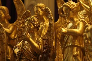
4) Fr. George Lane SJ continues to build the west side with a Historic 1879 G.F. Steinmeyer Organ being installed at Holy Family Church. Yes, this was once in the Danish National Cathedral, and yes Bach once tuned it, and yes, it sounds great on the West Side. Fr Lane also got these angels shined up.
5) The Insitute of Christ the King has won the Hyde Park neighborhood. How you say? When they moved in, empty lots were free for the taking. Only 2 years later the same lots are selling for $650,000 (too rich for me, but that is the going rate).
What an amazing way to build a neighborhood economy...take a bombed out church, say the Latin Mass, wear the traditional Robes, and Civilization has returned to the South Side, with a little help from Mt. Carmel High School and Tom Levergood at Lumen Christi.
Next up 5 Tasks
Tuesday, December 12, 2006
Englewood Church Tour (Part 1)
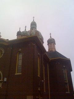
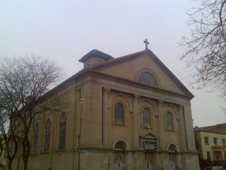
Yes, you may be taking your life in your own hands, but what better reason to take a risk than to see the lovely Churches of the Englewood neighborhood in Chicago. Englewood, near Sherman Park (and St. John of God), boasts 3 beautiful Churches I visited today. I will start with Nativity of the Blessed Virgin, a Ukranian Catholic Church at 4952 S Paulina St, (now the Apostolic House of Prayer). Onion Domes, Chicago Brick, seated squarely in the middle of Bungalow filled neighborhood; this is where the the Ukranians in Upton Sinclair Jungle worshipped, in a setting that does not seem Jungular at all.
Saturday, December 02, 2006
West Side Renaissance
Welcome back to the West Side of Chicago! The Mission of Our Lady of Angels (Grand and Pulaski) was dedicated today by his Eminence, Cardinal Francis George. The tireless Fr. Bob Lombardo, CFR (Grayfriar) pictured here with Cardinal George and VG Fr. John Canary, and a volunteer, has welcomed God's Providence to the Rectory, and was able to open the very nice adjoining church for todays visitors. The Rectory (not shown) is a splendid Venetian Palazzo, while the Church is very much in the style of Chicago Great, Joe McCarthy. Chalk one up for the good guys here!
Wednesday, November 29, 2006
TnT Architecture
Monday, November 27, 2006
Princess Gloria Thurn und Taxes and the South Side
The June 2006 issue of Vanity Fair Magazine mentions Princess Gloria and one of our local leaders:
"In 1991 she made her first visit to Lourdes, where she worked as a volunteer with the sick and dying who go there in hope of a miraculous cure. On a trip to Florence six years later, she became enthralled with Mons. Michael Schmitz, the vicar-general of the Institute of Christ the King Sovereign Priest, a conservative Catholic organization dedicated to restoring the Latin Mass. She also cultivated a friendship with the Bavarian-born Cardinal Josef Ratzinger, one of the most powerful figures in the Vatican."
Yes, that is Msgr Schmitz, the Vicar General of The Institute of Christ the King Sovereign Priest, heralding from the South Side at the old St. Gelasius Parish.
Good to see one of our own making the secular press in a very pleasant article about the restoration of Faith in one family.
Friday, November 24, 2006
It Can Be Done!
St. William, Austin, Texas: Before.
St. William, Austin, Texas: After.
More at The New Liturgical Movement.
St. William, Austin, Texas: After.
More at The New Liturgical Movement.
Tuesday, November 21, 2006
Scottish Rite Cathedral
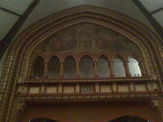
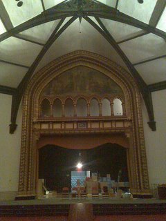
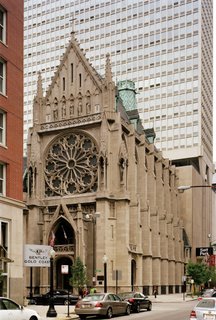
Yes, we do shy away from Masonic Architecture at the SSB, but the reason involves minimal mischief, rather, the buildings are just locked up so tight that you cannot get inside. Chicago's Scottish Rite Cathedral, the beautriful Masonic Temple, formerly the Chicago Unity Temple was open today, thanks to our good friends at the Newberry Library.
A Venetian Gothic landmark, with a madhouse of attached Mansions, subfloors, dressing rooms, this is a real must see in Chicago's Gold Coast. Yellow Joliet Limestone, similar to Holy Name and St. James Cathedrals, as well as the Water Tower, beautiful, primitive Arts and Crafts Stained Glass, and a magnificent organ all dazzle the visitor.
The stage/altarpiece is very Moroccan/Arts and Crafts Style, somewhat similar to St. Pascals, while the woodwork is quite similar to the fine Venetian carvings in the Chicago Athletic Association.
Anyone want to see more?
Wednesday, November 15, 2006
George Washington Smith and the Budget Church
I recently encountered the work of California revivalist George Washington Smith, who, despite having a name which sounds like a sixties novelty song performer, produced some intriguing if low-key work back at the beginning of the last century. Smith did not produce the most exciting work of the Spanish Colonial revival, and on the whole his work consists of those polite, plain-vanilla workmanlike background buildings that, in a more civilized age, would not require architects to get right. Still, his few ecclesiastical works show a more sophisticated touch within that simplicity, and offers much food for thought for those who would produce high architecture at a low cost.
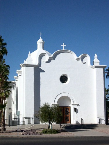
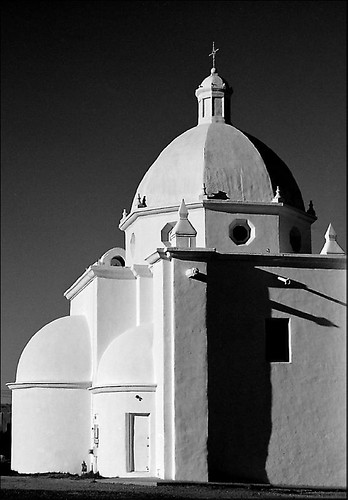
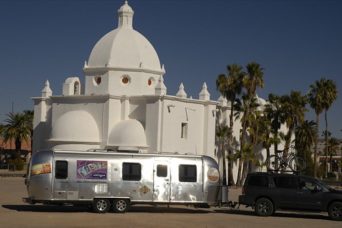
Front Elevation: Immaculate Conception, Ajo, Arizona. A complex and beautiful detail--and one which would be fairly inexpensive to reproduce--enlivens and elevates an otherwise simple facade.
My favorite Smith work, and one of only two churches I am aware that he undertook, is the parish church he designed for Ajo, Arizona (the name means "garlic") as part of a masterplan for the would-be southwestern-style garden city. Immaculate Conception is intriguing, first, as it was designed as part of a new urban context, and not merely plopped into a suburban lot with only convenience as the determining factor. It faces onto the town's curvilinear main plaza, flanked on the opposite side of the road by a Protestant church originally intended to be of similar, if smaller and simpler, design.
This move--of differing denominations given equal time on a main square--is not an uncommon move in more recent attempts to plan an ideal city in a religiously mixed society; Lutyens did something similar with his plan for Hampstead Garden Suburb where the established Anglican church sends its spire upward next to the domed top of a Free Church meeting house. More recently, the folks at Seaside plopped a nondemoninational chapel down in their town more as a bit of urban furniture than an actual place of worship, and even then, as a civic gesture, the strange bit of preserved dune scrub later placed between the chapel and Seaside's Ruskin Square effectively negates any meaningful relationship between it and the town as a whole.
The church at Ajo has the happy advantage of being built in the southwest--like most of Smith's works--and thus is built in an adaptation of the local Hispano-Mexican vernacular. Stucco and adobe are capable of covering a multitude of budgetary sins, and also have the advantage of adding interest through their mottled surfaces to the vast unadorned walls that are often forced on the unmoneyed client. At the very least, with Catholicism raplidly expanding in the south and west, a careful study of such stucco and adobe work seems a very good idea for a church architect to undertake.
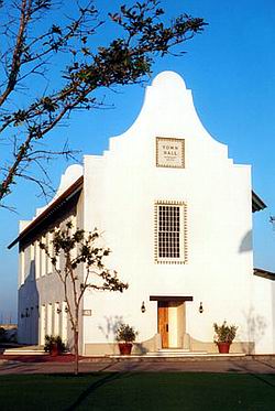
Merill & Pastor's recently completed elegant Carribbean Colonial-inspired Rosemary Beach Town Hall in Florida.
Recent secular work, such as that undertaken at Seaside and Rosemary Beach by firms such as Merrill Pastor show that not all modern stucco-work is of the supermarket strip-mall variety; such a wall-driven aesthetic allows money to be spent on refining and detailing to the highest level only very crucial symbolic and practical points in a church project. Smith is not the only architect within the last century to do decent simple work with the style--indeed, mixtures of low mission baroque and Romanesque revival crop up in an astonishing number of places and with a surprising quiet dignity. There's even a handsome mid-century brick-and-stone Romanesque church in chilly and distinctly un-Hispanic South Bend, Indiana, with a few generic Baroque flourishes that elevate it from commonplace to clever, especially considering the budget it was doubtlessly built on.
Indeed, Smith's other ecclesiastical project, a funeral memorial chapel-cum-vault, is in that mixed Romanesque-Baroque mode, with a simplified Baroque dome and a stripped-down Lombardic-inspired gable. It is a flexible style, and worthy of emulation for those having to count their pennies. Still, I'd caution architects to be careful with their revivalism--I can think of a good many bad Taco Bell-esque edifices inflicted on the Southwest, as well as even fairly good Spanish Colonial-style structures in places where they manifestly don't belong--wet South Florida, where a whole pueblo would wash away in one hour of summer rain, or even Minnesota, where vigas and bell-walls simply don't belong.
Holy Cross Parish, South Bend: Not a George Washington Smith project, but a somewhat later example of mixed Romanesque and Baroque elements, here adapted to a Midwestern contect.
Smith's church is more baroque than it is Romanesque, and it points to the curious fact that while America has always felt mildly uncomfortable around this most Italian and Catholic of styles, somehow in the southwest, its Spanish cousin seems to avoid setting off alarm bells for one of our nation's numerous stylistic neuroses. Perhaps the Franciscan connection is appropriately soothing. Whatever the reason, Smith's design is a brilliant example of how simplified Baroque detailing can enliven a remarkably plain, even stark, facade. Gothic suffers when reduced to basics, and full-blown pure Romanesque really requires real stone (and sometimes brick) to truly sing.
Immaculate Conception: the apse. Note the complex results achieved through the judicious combination of simple elements and the visual interest resulting from the distinct texture of the stucco. .
Immaculate Conception is a brilliant budget response to both the historical context of its site, and designed in such a way that its environment almost automatically brings out the best in it. Using a dome, rather than a campanile, to be the visual focus of the composition, is particularly clever, as it serves to dignify both the interior of the church and its exterior. A campanile has presence only on the exterior, and its purpose can be easily duplicated through a simple bellcote. The rough stucco enlivens potentially dull blank surfaces in a time-tested way seen across the whole of the Southwest--Georgia O'Keefe's painting of the oddly massive and unintentionally sculptural rear buttress of the Rancho de Taos parish church comes to mind--while its blinding whitness is all the more beautiful under an Arizona blue sky that lends itself to simple silhouettes. Still, while simplified, it is not merely simple, and its component parts not basic building blocks but cleverly massaged to pack the most into very little. While fairly cost-effective for its time, the design does not shy away from complex elements such as a dome or a conceptually elaborate--if simply rendered--broken pediment. A project such as this shows that baroque detail need neither impare the cost of a church, nor is it a style alien to the roots of American Catholic culture.
Immaculate Conception: Another view of the rear; note the bellcote to the left of the dome. On the whole, striking: though the dome's lantern might have been more interesting with true windows, rather than being blind as designed.
Simplicity does not mean plainness, or austerity. Nor does it is achieved by shying away from "fancy" details such as domes, cupolas, vaults or the elegant touch provided by a judicious bit of baroque detail. Such are the lessons taught by the church at Ajo, and they speak to the future of parish projects across both the Southwest, and in more abstract ways, the whole country.
Tuesday, November 07, 2006
Evangelizing Through Beauty
The renowned speaker and evangelist Fr. Robert Barron will be giving a lecture titled "Evangelizing Through Beauty" on Monday, December 4 at the Union League Club in Chicago. Fr. Barron, of fame for the Word on Fire series on EWTN, is a Chicago native tasked with evangelizing in the Archdiocese. Here are 4 good reasons to attend the lecture
1) World renowned speaker and scholar talking about a subject critical to the mission of the Society of St. Barbara
2) Free lunch, courtesy of the Archdiocese (don't worry, you will get hit up for a donation later)
3) Meet likeminded souls, searching for the truth during their lunch hour
4) Marvel at the surroundings of the architecturally stunning Union League Club of Chicago, pictured in this entry.
Please contact John Powers if you can attend. Room is strictly limited to 200, so RSVP is necessary.
Tuesday, October 24, 2006
More Great Libraries
Great Libraries of the World
Looking for the perfect Christmas present?
Look no further than our corresponding organization in Sweden, the Renaissance Library, publishers of the Renaissance Library Calendar.
We have worked closely with Stuart Irwin at The Renaissance Library Collection to produce this year's calendar...as this year a Chicago gem is featured, the Archdiocese of Chicago, and Mundelein Seminary that is..the Feehan Memorial Library is the November library of the month. Tens of Thousands of photos of the Feehan Library will be distributed and recognized as on of the great libraries of the Architectural Renaissance (albeit, this restoration being from the 1920's). Order as many as you like at $12.95+ $3.05 = $16.00 including UPS Ground freight. All proceeds go to the Bricks and Mortar Foundation.
Sunday, October 22, 2006
New Shrine Coming to Chicago?
Good Show on the South Side
Picture this...50 people crowded into a rectory basement, hanging on every word of a dedicated young Notre Dame architect from Columbus Ohio, talking about the crowning achievement of a dedicated architect from Notre Dame, albeit 80 years ago. To top it off, the crowning achievement is up the stairwell, and across the garden, an architectural masterpiece waiting to be restored. Henry Schlacks is making a comeback in Hyde Park.
Who was there?
The Clergy from the Institute of Christ the King; several highly energized young architects/architectural students/Holy Whapping from Notre Dame; the undeniable Joe McHale-the grandson of an architect even more prolific than Schlacks-Joe McCarthy; a group of traditional minded Catholics from Wayne, Illinois who had met a ICK priest in France and wanted to see what is going on; about 20 parishoners who attend the Latin Mass at the Rectory basement; a smattering of architectural buffs a few locals from the neighborhood, and a carload from the north suburbs who just came for the food (including a cake from Oscar-from St. Stan's and the Shrine of the Divine Mercy)
How can you help?
A great recommendation from Msgr Schmitz is to pray the Chaplet of the Divine Mercy at 3pm each day to seek intercession from Our Lady.
How can Our Lady Help?
One of my favorite parts of the litany is the Help of Christians, of which Our Lady is certainly up to task. Perhaps her intercession may induce you to:
1) Attend Mass at the
Shrine of Christ the King
6415 South Woodlawn Avenue
Chicago, Illinois 60637-3817
2) Volunteer your time and labor to restoring this marvel
3) Send a check to Cristina Borges at Christ the King, formerly of EWTN, now leading fund raising at ICK
4) Spread the word. Contact Crisitna for more details cborges@institute-christ-king.org
Tuesday, October 17, 2006
Two Art Deco Church Facades
Recent Speculative Work by Matthew G. Alderman
A Design for a New Facade for Visitation Church, Miami, Florida, in the Art Deco Manner. Elevation with Plan. September 2006.
Over the next few decades I imagine the most important task facing the next generation of church architects will not be the construction of new churches--though that will certainly will continue to occur, and with increasing frequency--but the renewal of existing structures in order to restore them to liturgical and artistic orthodoxy. This trend is already beginning to make an appearance in some quarters--Duncan Stroik, H.H. Menzies and Stephen Schloeder have all tried their hand at this problem in various projects, and I imagine they won't be the only ones in the near future.
The harmonious renovation of existing buildings is an issue which has fascinated architects for ages. One long-standing debate during the Renaissance concerned whether some of Italy's Gothic cathedrals at Milan and Bologna should be completed in the classical style then prevalent, in some form of Gothic, or some common denominator between the two. Indeed, those defending Gothic continuity often cited the reigning orthodoxy of Vitruvius, saying that ideally a structure should be a harmonious whole than a collage of disparate elements.
There's some grain of truth to either approach; design unity is a luxury that has largely been only possible in recent centuries, and, as a consequence, many of Europe's churches are an appealing organic mish-mash of times and fashions. Still, my own preference is for stylistic continuity when it can be managed. Of course, presently we also face the problem that a good many of the churches we may renovate are essentially stylistically bankrupt, which suggests any renovation of their design would be, in the best of all possible worlds, essentially using the existing interior and exterior as a framework on which to overlay new plasterwork, vaults and other details. Some may cry at the apparent structural dishonesty, but despite what the modernists may tell you, very few buildings done in recent years have truly been structurally honest--a slippery term at best--and anything built today by necessity will require some sleight-of-hand to cope with the viscera of wiring, air ducts and other miscellanea that modern comfort requires.
Still, in some cases, the church may be too outre to be able to stand such a renovation--Los Angeles Cathedral comes to mind; trying to straighten out its crooked angles would be an exercise in futility, and the outside is beyond hope. Short of turning the whole thing into a parking garage, subtler changes, such as flattening the sloped floor and putting in place a more traditional chancel arrangement in a style that, while not outright copying Calatrava's oddball choices, at least tried to find some middle point between it and tradition, would probably be the best that could be done under the circumstances. Or you could turn it into a yarn factory like Sixtus V planned to do with the Colosseum, which is much prettier.
Fortunately, the church I worked with had a lot going for it already.
On the opposite extreme, you see, there are some humbler modern designs, of an astylar simplicity and liturgical orthodoxy, that require a similarly discrete intervention--not because they're beyond hope, but because they already are quietly pleasing in their own way. A more invasive reworking might be both budgetarily prohibitive and liturgically unnecessary. I recently was invited by the pastor of Visitation Parish Church in Miami to propose, hypothetically, a narthex extension to his church building, which required such a discrete intervention.
The church's design is fairly simple, essentially lacking a canonical style but with hints of Art Deco, one of several virtually identical structures put up in the late fifties by the Archdiocese of Miami. While simple, it nonetheles possesses an appropriate longitudinal arrangement, and the good father had already begun on some sensitive and discrete additions to the sanctuary in good materials--including marble--that would harmonize with the existing design without necessarily being limited by its comparative humility. The church's most notable attribute, actually, is a splendid shiny terazzo floor which the priest had recently added a series of inlaid symbols up the main aisle; however, it also possessed a very low ceiling, which, while less distracting than one might think in the interior, resulted in a fairly unremarkable silhouette from the outside.
Visitation Parish Church's status quo.
These additions, which were intended in a speculative way to brainstorm ideas for the longterm expansion of the parish, consisted of a program set out by the priest: a narthex flanked by a bookshop and a small kitchen for distributing after-Mass coffee. The arrangement I proposed required the extension of two small storage spaces on either side of the church's open porch forward by a bay, and dividing the interstitial space into a glassed-in narthex occupying the same space as the existing exterior gallery, and a new open-air porch to take its place. The style was to be an art deco that harmonized with the existing church, though slightly higher in style as with the altar modifications.
The choice of deco proved to be an interesting challenge. Miami's native style is, in some sense, art deco, though Miami deco has a certain neon extravagance that suggests the grand hotel and the cinema than God; however, the sort of deco the we proposed would be discrete enough to allow reference, in an abstracted way, to the simplicity of Romanesque and other more conventional ecclesiastical styles.
Originally, we'd thought to make the two separate volumes on either side of the narthex into low towers, but it struck me that lifting one single tower or false-front bell-wall of sorts in the center would provide a sufficient lift to the low outline of the church, while also cutting down on the costs that two smaller towers might entail. The bell-wall is a feature of Spanish colonial and Sicilian baroque architecture, and one very suitable for American ecclesiastical architecture in this age of privation as it eliminates the very expensive proposition of a separate campanile while increasing the height and prominence the front elevation. Here, the bell-wall is somewhat abstract, as I've not drawn bells in its three arches; however, if the parish had an interest in using them to house a small ring of bells, the arches could be increased slightly in height to avoid the bells crowing the large Crucifixion scene that occupies the center of the composition.
In terms of color and materials, I imagined the addition to be predominantly of pale yellow stucco. The faux-adobe white that this architecture might suggest, and which is not unknown in South Florida, seems rather silly. While the area was Spanish in name at one time, the swampy ground and humidity would have precluded the use of the mud bricks of California and the Southwest there; indeed, Spanish architecture in Cuba is mostly stone or non-adobe based, and in the few places where Spain gained a colonial foothold in Florida, is more about wood, coquina rock, and perhaps more ordinary sorts of stucco over brick. The lower half of the wall is painted a blue to recall the waters of St. Elizabeth's child, John the Baptist, while statues of St. Elizabeth and the Virgin stand in shallow niches on either side.
Further additions or developments to the design might include modifying the kitchen plan to include an open distribution window facing the parking-lot and a small open-air arcade running along the side of the church connected with the window for parishioners to enjoy their post-mass coffees.
A Design for a New Facade for Visitation Church, Miami, Florida, in the Art Deco Manner. Early design. Elevation with Plan. September 2006.
This was actually the second design I did for the project, the first getting out of my system the more flamboyant aspects of the style. I realized, after stepping back from the project, the bell-wall was probably too tall and would have to become a real tower, and the whole thing looked a bit too much like a movie theater. However, such studies are very useful to explore both the good and bad impulses that may cluster together at the onset of a project, and also to give a context to later evolutions of the design. While unsuitable, this earlier version nonetheless employed a decorative language which would not have been probibitive in cost, while the scalloped top of the spire produced a silhouette that the good father found intruiguing and might be worth incorporating, in a less etxreme form, into the current bell-wall design should this project become a reality. At the very least, given the ubiquity of this church design in Miami, such architectural experimentations provide food for thought beyond the confines of a single parish.
Monday, October 16, 2006
More Shrines Please! Holy Hill
Celebrating the declaration of Holy Hill as the newest Basilica in Wisconsin (and in the USA), my family enjoyed a trek up Holy Hill and its massive tower, to visit the Discalced Carmelite Shrine, and site of at least one miracle, in my non-qualified estimation: The building itself.
German, grand, the tallest building for miles, old-by USA standards, well kept, massive, a hermitage, site of a 1676 pilgrimage by Fr. Jacque Marquette, curative to the disabled, and one of the points of pride in Wisconsin architectural heritage; all available 25 miles from Milwaukee at Holy Hill.
Friday, October 06, 2006
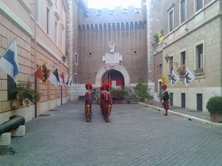
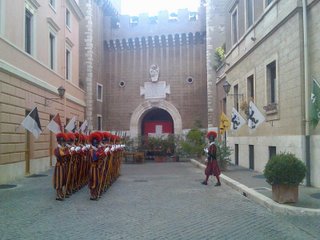
When in Rome, with the Swiss Guard
Sunday, October 01, 2006
Top Hospital Chapel: John and Lizzies, London
Arguably, the best looking hospital chapel in the world is shown in these photos I took this morning at the Hospital of St John & St Elizabeth is an independent Sovereign Military Order of Malta hospital in St John's Wood, London. Face it, a Knights of Malta Chapel sure beats the typical broom closet chic we see in Catholic Hospitals in the USA (if they dare have a chapel at all).
I noted, the Chapel doors were wide open, as were the interior doors towards the hospital, with no discernible negative effects, smashing the myth that you cannot have an open church in the inner city.
Saturday, September 30, 2006
Fighting Irish Restoring South Side of Chicago
Two big names from ND, none other than Bill Heyer, and the founder of the Notre Dame architecture program, Henry J. Schlacks have something else in common. They have both worked on the grand St. Gelasius (Clara) on South Woodlawn in Chicago.
Come on down for a presentation by Mr. Heyer on HJ Schlacks.
Rome to Chicago: The Classical Patrimony in Churches of Henry J. Schlacks
On Sunday, October 22th at 3:00 pm, there will be a conference by classical architect William C. Heyer on Henry J. Schlacks within the vast space of one of his neo-Renaissance masterpieces -- the historic landmark once known as “St. Clara Church” in south-side Chicago. This magnificent lime stone edifice was built in 1923-27 and was home to a thriving church community. Eventually closed in 2002 and scheduled for demolition, the building will now be fully restored by the Institute of Christ the King Sovereign Priest, following early Baroque Roman models for its interior.
Architect Henry J. Schlacks was one of the leading figures in the late 19th and early 20th century historicist Revival movement in architecture, designing many of the magnificent churches in Chicago. Schlacks traveled extensively in Europe, carefully studying the great and lesser known masterpieces of architecture of the old continent and applying this knowledge to his many works in the city. Among these is the former St. Clara in the south-side, now a historic landmark renamed as the Shrine of Christ the King Sovereign Priest.
Mr. William C. Heyer graduated summa cum laude from Pratt Institute in New York City, and after apprenticing with Thomas Gordon Smith, founder of the classical architecture program at the University of Notre Dame, obtained his Master’s degree from the same university, having conducted part of his graduate work in Rome. He has worked in classical studios in New York City, Washington, DC, and in 2002 founded his own classical architecture studio in Columbus; he is the architect assigned to the restoration of the Shrine of Christ the King Sovereign Priest. Mr. Heyer has written in Sacred Architecture Journal, Period Homes Magazine, and Culture Wars magazine, as well as The Latin Mass magazine.
The lecture will take place on Sunday, October 22th at 3:00 pm at the Shrine of Christ the King Sovereign Priest, and a reception will follow. 6401 S. Woodlawn Avenue, Chicago, Illinois, 60637. Parking is available in the adjacent parking lot. Take Lake Shore Drive to Hayes Drive/63rd Street, then 1.5 miles west to Woodlawn.
For more information and to register call 773-363-7409.
Wednesday, September 27, 2006
Meeting with Cardinal Arrinze in Rome
From Rome
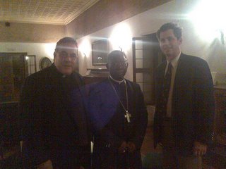
Add this to any believe it or not file you may be keeping. I was blessed to present the Society of St. Barbara to his Eminence, Cardinal Arrinze, head of the Vatican Office of Divine Worship on Sunday Evening. The Cardinal showed a great interest in Traditional Architecture, the Liturgy, and in keeping Churches in tact.
The Cardinal is in correspondence with the Society of St. John Cantius, the Liturgical Institute, and Notre Dame concerning ecclesiology, and was very supportive of the efforts of SSB to restore the sacred nature of church architecture.
I promised not to post personal photos, but in this exception, here is Fr. Robert Sirico, Cardinal Arrinze, and John Powers, in a photo by Kris Mauren.
Tuesday, September 19, 2006
Quigley Preparatory Seminary to Close
This from the Archdiocese of Chicago:
After much deliberation and consultation with a committee of official representatives, including the rectors of our various seminary systems, Francis Cardinal George, O.M.I. has approved the recommendation to close Archbishop Quigley Preparatory Seminary High School in Chicago. Quigley will close at the end of this academic year on June 15, 2007.
For the last 101 years, Quigley Seminary has served the Archdiocese of Chicago by teaching thousands of young men to keep the Word of God alive in their hearts and their minds while preparing for their life choice in the seminary system or as good, Catholic laymen who have gone on to serve the Church, the community and the nation.
The changing patterns of vocation discernment has had a great impact in the ability to maintain a high school seminary program. For many years Quigley has been one of the few high school seminary preparatory schools in the United States. Declining numbers of students, along with growing costs per student associated with operating Quigley, have also led to this difficult but necessary decision.
It is the intention of the Archdiocesan leadership to continue to find new ways to help young people in the Archdiocese of Chicago listen for God’s call to the priesthood and religious life.
The historic Quigley buildings at 103 East Chestnut will undergo a year-long remodeling and restoration project and will become the new home of the Archdiocese of Chicago Pastoral Center.
The Society of St. Barbara requests your prayers (to the Lord) and suggestions (to the hierarchy) that the public continue to enjoy access to the Zachary Taylor Davis/Joseph McCarthy Masterpiece, and that the Archdiocese renews its commitment to high level classical education by other means than Quigley at the end of its glorious service.
Saturday, September 16, 2006
The San Gennaro Festival, New York City
The famous San Gennaro festival, exemplifying that splendidly exuberant tackiness and compressed Italian identity that could only come out of the weird and wonderful pressure-cooker of the American melting pot, kicked off this last Thursday. I can smell the zeppole dough, the overpriced sausages and onions simmering, the never-ending procession of funnel-cake stands, all of it, as I walk to work from the subway stop. It's the sort of crazy, shiny, brightly-colored turn-your-brain-off fun that has a certain garish, wholesome simplicity to it in small doses, seasoned with a touch of the appealingly grotesque and, in the end, sanctified by the bright polychrome image of St. Januarius himself, the guardian of all that is popular and populist within the Catholic soul.
Though I do have to wonder--why does one festival require ten identical sausage-and-zeppole stands, two identical perfume-selling booths? Or, more to the point, are there any funnel-cake sellers left east of the Hudson who are not at Mulberry Street right now?
The Madonna in the forecourt of Precious Blood Church.
Modern-day firsfruits.
The saint of the day.
Can Grande.
Cavallo piccolo.
Thursday, September 14, 2006
The San Rocco Festival, New York City
A Memory from August
My first introduction to the cultus of San Rocco came, through, of all things, a screening of The Godfather II. A close friend of mine had been so taken with the scene where young Don Corleone rubs out...well, I honestly can't remember who was shooting who, or whether it was before or after they ended up stealing that sofa from Fanucci's house, but the point was, the tenement murder was juxtaposed against the procession outside, profane blood against the sacred, gunshots muffled by celebratory firecrackers. As a consequence, San Rocco and his procession have since been surrounded by a strange and holy halo in my mind, a primal, earthy good full of the sun and grapes of Italy that will forever justify and counteract whatever petty violence crops up in a culture.
Also, it's hard not to remember the supremely odd and rather oddly wonderful image of a gilded, wooden saint cloaked in a feathery fringe of a hundred dollar bills, one of those apparently inexplicable but somehow significant bits of folk-Catholicism that so impress themselves on the mind.
The word earthy is particularly appropriate here--and the Frenchman Roque's feast comes from the Italian earth of Potenza, where, as San Rocco, he is highly venerated. His spiritual children brought him and the festival with them across the sea to the new world, a rooted, organic presence to turn to in the grime, confusion, smoke and steel of the New World. He is popular--as in the sense of in the people, and his festival is full of the popular enthusiasm and deep-rooted and God-given spiritual cravings that humanity can only manifest, can only express and attempt to satiate through the medium of the physical. It's the sort of impulse that some might call pagan, and indeed it was prefigured in some pale way by the dim, smoking sanctuaries of the Greeks and Romans, but it reaches its ultimate apotheosis and justification in the Christian ideal, the redemption of the physical that is the Incarnation.
San Rocco's feast is a commemoration of the long-suffering saint's life, of his pilgrimage, his plague-wound, and his anonymous, humble death, but it is also an opportunity to present the first-fruits of the harvest to God. There are the dollar-bills--an ancestral muscle-memory of the days when San Rocco might have been garlanded with wheat and grapes, something that an outsider might condemn in five seconds as idolatry, but in five minutes makes perfect sense. And then, as we processed around, I realized that every time we stopped in front of a restaurant, a mortician's, another restaurant and deli, we stopped and turned the statue around with a florish of Little-Italy brass and clapping and "Viva San Rocco!" each proprietor had put an elegant display out along the processional route of all his produce--a dinner-plate of pasta, plastic-wrapped, bottles of wine, glasses, slices of mozzerella, as an ex-voto of thanks for another good year, passed on to God via his saint Rocco. A literal mind might condemn this as a superstition, seeing only its physical form, but the Italians and Italian-Americans are too forthright and sensible not to see its true spiritual significance.
Prayer is a sacrifice of time, a superfluous and "excessive" act--just as is the gift of a bushel of grain or a sack of flower to the cultus of a saint who would seem to have no immediate use for it. Like the Magdalene and her jar of perfume, sweetening the feet of Christ for the sake of sacred excess.
An Aside on Gothic Deco
Originally Posted on The Shrine of the Holy Whapping
I recently visited the Cathedral of Mary Our Queen in Baltimore with the Sober Sophomore as my fearless tourguide, as well as checking out the the old neoclassical Basilica from the outside; it won't be re-opened until after they're finished re-Latrobizing its plesantly stoic interior. (My initial reaction is that it looks too clean and will probably be much more agreeable when twenty years of exhaust fumes have mellowed it a bit).
The tympanum of the front portal of Mary our Queen, Baltimore.
The new Cathedral is an example of a peculiar and once peculiarly popular style, a sort of hard-edged deco take on Gothic which has a way of turning up in odd corners of the U.S. It can vary from the sculptor merely giving a certain chilly Works Progress Administration look to the figures as at Atlanta Cathedral, or a full-blown and surprisingly stripped-down skyscraper aesthetic, like that at, of all places, the cathedral in bucolic La Crosse, Wisconsin. Sometimes, the effect is kitschy Busby Berkeley, but more often than not, it can be quite striking, if one gives it an honest chance.
Christ the King, Atlanta. A strangely small cathedral of a cold sort of gothic, but not without a certain appeal.
While not as satisfying to me as more ornate and historically-minded forms of less radical takes on Gothic, these projects are nonetheless worthy of our consideration, both as period pieces and also as a fascinating lesson in architectural design both pro and con. Chicago has a disproportionately large number of them, as well as deco-izing forays into Romanesque and other styles, and almost all manage to convince as pieces of appropriately well-balanced work, not dependent on novelty but very competent expansions of the tradition down various side-paths otherwise ignored today. It is a bit on the modern side (and that opens a whole other field of questions I've not yet examined), but it is by no stretch of the imagination modernist.
The high rise was a favorite structure to Gothicize at the turn of the last century, and some of that verticality crept into the funkier turns of some of the other takes on modernity--deco, streamline moderne, and various simplified forms of classicism--that have since ended up getting lost in the historical-architectural shuffle. Deco has always struck me as a modern style which fits in more clearly inside the classical tradition, considering its interest in an ornamental language and iconography, and an external expression more in keeping with the traditional past. And while art moderne curves and portholes can be overdone, they have a sort of intriguingly low-key sense of geometric invention which appeals to my baroque side.
At the very least, they're better than glass boxes, and not without a certain charm, even if a whole city block in that manner would undoubtedly overwhealm. In a sense, we can term the more historicizing turns of these styles as a sort of subconscious "classical survival," just as some have spoken of a "gothic survival" that ran under the radar in Renaissance and baroque days. Most architects of the time considered themselves very modern, no doubt, but the subsequent spectrum-skewing weirdness of Eisenmann and Gehry virtually makes them honorary classicists. Certainly churches like Mary Our Queen are Gothic Revival Survival, and, as an organic link to the past (or the closes thing at present), worth our consideration and time.
Cram's most unusual take on the modern is Pittsburgh's East Liberty Presbyterian, with a crossing-tower derived from reverse-engineering the Empire State Building into a Gothic milieu. The result is exotic and rather appealing.
If I may be permitted an aside, it is interesting to note that Cram himself, the premier neo-Gothicist of our age, was quite enamored of skyscrapers and his work got uncharacteristically stark in his twilight years. He himself seems to have made little distinction between deco and what is now simply called Modernism despite the deco tendencies in his late work--which I would argue was less irritatingly revolutionary than he thought. And I mean that as a compiment.
Being experimental, Gothic Deco never quite reached the perfection of a polished style, and may vary from deco modernism dressed up in a thin layer of Gothic--sometimes fun, sometimes mildly silly, and not quite properly ecclesial--to a fully-thought-out and coherent synthesis. In these better examples it is perhaps more useful to consider it not necessarily merely a "modernized" Gothic (even if its makers thought so) but a Gothic of a chunkier, more masculine aspect, avoiding chronological snobbery, either of a historicist or modernist slant. It is not the only "modern" approach to Gothic, as the historical treasure-trove of the period still offers much exploration without necessarily injecting a deco element; at the same time, it is a fascinating approach to this manner of design.
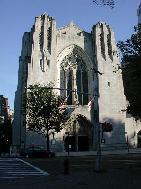
The two best examples of the style are the most strongly synthesized, and are simultaneously the most vigorously hefty and the most Gothic at once. One of them is just a few blocks away from my apartment. I walked by there one afternoon under a dirty pearl-grey sky with the smell of ozone in the air. It's the Episcopalian Church of the Heavenly Rest, a massive and yet surprisingly vertical structure which succeeds in mingling Romanesque mass with Gothic vigor. Something about its fluted spires suggest living rock, or the facets of a spiky crystal, and indeed a few of the blockiest bits on the side indicate bits that never got carved.
The Church of the Heavenly Rest, New York City: a curious but successful blending of chunky Deco and turn-of-the century Gothic.
It's not a church that work work everywhere, of course. It is a stunning piece of work, though one that would best thrive amid the hefty towers of a high-rise city. It is the answer to a very specific architectural and theological question, but it seems to me the right answer in this instance. I could perhaps see some of this approach working in a church dedicated to some military martyr, to St. George, for instance, though somehow the curious titulus of Heavenly Rest suggests a more delicately vegetal art-nouveau evocation of Gothic to my mind. The sculptural program continues this blocky deco trend; it works in the context, but I wonder if perhaps the vigor of the building might not have been more improved had we seen more delicate angelic visages rising from rough-hewn folds in the manner of the cowled tower guardians of Goodhue's St. Vincent's. Still, it holds its own well against its often inhospitable urban surroundings.
The Heavenly Rest from the outside, from across the street at Central Park. Like all good city churches, it dominates in spite of its surroundings.
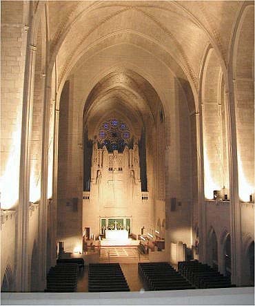
The second, Queen of All Saints Basilica, stands in Chicago, and is notable for the extremely late date of its completion, 1959. It may well have one of the the last tradition-minded churches built in America until the present revival, and is of a Gothic which has a distinctly twentieth-century feel to it, but at no sacrifice to its iconography, beauty or craftsmanship, or its ability to be taken seriously. It is modern, but not irritatingly or faddishly so. Indeed, its iconographic scheme is a fine example of the (old) Liturgical Movement's concept of "anticipated eschatology"--an iconographic program which serves to highlight the earthly Mass by its representation of the heavenly liturgy. Though the mural behind the altar, of the Trinity in a burst of glory, placed in conjunction with the spire of the reredos, looks a little too much like a graphic of a '30s radio tower to not incite some small amusement in me.
Queen of All Saints Basilica, Chicago, completed at the astonishingly late date of 1959.
Then there is La Crosse Cathedral, which occupies the opposite side of the spectrum in being more modern than it is Gothic, but nonetheless it manages to preserve a convincing sense of liturgical hierarchy. Architecturally, it's rather cold, but it remains a fascinating period piece. Its sanctuary, spacious and broad with numerous choirstalls and a freestanding altar meant to be used ad orientem, is a model of how a cathedral's chancel should be built (though it could use a big crucifix as a focus), while one of its side chapels, dark, atmospheric and vaulted in black-and-gold is a surprising find indeed for this forgotten and pleasantly real little town. The aesthetic is a bit too stripped, and the distinction between walls and vault somewhat lost in the process, while the vast facade is of a startling blankness which succeeds in impressing more by its size and contrast to surroundings than its intrinsic qualities. The outline is striking, but could bear a bit more filling in. It could get dull after a few days. That being said, photos I've seen of the Bishop's chapel are nothing short of wonderful, and very clearly designed by someone who knew the Tridentine rite well.
St. Joseph the Workman, La Crosse, Wisconsin. A brooding, stark sort of abstract Gothic; interesting forms in need of some more development.
And then there is Mary Our Queen. Like La Crosse, the interior is more striking than the exterior--indeed, I find the exterior more than a little strange, too reminiscent of the government office building where my father works, down in Florida. It is also a bit less abstracted than La Crosse, if not as studied in its details as the Heavenly Rest. The lines of its nave are most striking and noble in their loftiness, and austere but in a way that doesn't suggest their decoration was undercooked somehow. The high side-aisles continue the tradition established at St. John the Divine by Cram, itself begun as a response to the peculiarities of the site and project, of going virtually all the way to the vault of the nave, producing a pleasantly airy affect distinctly Gothic in spirit.
Mary Our Queen, Baltimore; a late work by Maginnis and Walsh, the architects of the Basilica in Washington.
Spots of elegantly executed polychromy brighten vaults and rafters not unlike Queen of All Saints. Many of the side-altars, tympana and the baldachino are, while very deco in inspiration, are nonetheless astonishingly well-crafted and quite intelligent in their iconography and their liturgical layout, especially considering the late date the project was undertaken. It would be instructive to compare it with another modern-historical hybrid of the same era and place, the massive National Shrine in DC. I've heard every conceivable opinion about the place, from undying devotion to unalloyed hatred, but that's a topic for another day, too.
Lady Chapel, Mary Our Queen. A striking bit of liturgical sculpture. This photograph does not include the curious five-sided tester canopy above.
I've got broad tastes, I admit, but I also find it instructive to consider the pros and cons of every work I enjoy. The vigor of Gothic Deco is the strength, and quite apparent, but the con is that in many cases, the architect was trying a bit too hard to be unique. It is good to strive for innovation within the tradition, but pushing an idea too hard can really ruin it. Better to use a tried-and-true formula if you're not quite sure. In some instances, the inherent angularity provides an interesting new spin on Gothic attenuation, but not everything, especially when it comes to statuary, has to be hard-edged, neo-primitive, over-stylized. As with much art, and much of my favorite work by painters such as van Eyck, the right balance between nature and symbol is the key to successfully expressing the Divine. Now that the flush of novelty has long worn off, it is possible to reconsider such choices, and the whole movement, with the luxuriantly long hindsight of tradition.
Subscribe to:
Posts (Atom)